-
-
Sort through our administrative resume examples to see what works best for you.
-
Our sales resume examples can help you write the best possible resume.
-
Explore our food service resume examples to show your skills effectively.
-
Start crafting your job-winning resume with our teaching resume examples.
-
-
-
Use our administrative cover letter examples for ideas on writing your own.
-
Use our sales cover letter examples to effectively show your sales accumen.
-
Write your job-winning cover letter following our nursing cover letter examples.
-
Learn to tell your story in education using our teaching cover letter examples.
-


Resume Layouts: Free Examples & Templates
Use a streamlined resume layout with margins, headings, lists and white space to make your skills and qualifications pop. Lay out your resume for clarity and impact.

- Our customers have been hired by*

The 5 Best Resume Layout Templates
A good resume layout will highlight your skills and experience, making it easy for hiring managers to process your qualifications and compare you against other candidates. The following templates use professional resume layouts to give you a head start.
Find the best templates with optimal resume layouts and helpful formatting tips to improve your application.
Professional resume layout
These professional resume layouts use clean design and elegant spacing to guide your eyes to key information, making it easy for hiring managers to find notable accomplishments quickly.

Basic resume layout
Simple resume templates are great for digital and physical jobs. These templates outline your qualifications using optimal resume layouts, such as bold headers, uniform margins, and fonts.

Creative resume layout
Although these templates have a good resume layout with familiar resume sections, they also use colors, icons and unique fonts to stand out in a sea of standard applications.

Modern resume layout
These unique template designs feature cool color patterns and modern two-column resume styles to make your credentials stand out!

Word resume layout
Many resume layouts Word downloads are free and convenient because their formatting is consistent across multiple operating systems. We build our Microsoft Word templates with an award-winning Resume Builder.

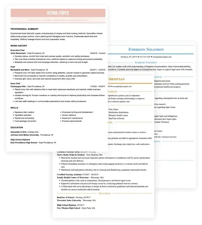
Free Resume Layout Example
CONTACT INFORMATION
First and Last Name
City, State ZIP
Phone Number
Email
PROFESSIONAL SUMMARY
A professional introduction is limited to two or three sentences. Share your experience level, relevant skills or up to two accomplishments with quantifying data to help hiring managers find matching experience.
SKILLS
- Skill 1
- Skill 2
- Skill 3
- Skill 4
- Skill 5
- Skill 6
- Optional Skill 7
- Optional Skill 8
EXPERIENCE
Job Title | Employer
City, State | MM/YYYY – Present (last day worked)
- Job description or notable accomplishments.
- Job description or notable accomplishments.
- Job description or notable accomplishments.
Job Title | Employer
City, State | MM/YYYY – MM/YYYY
- Job description or notable accomplishments.
- Job description or notable accomplishments.
- Job description or notable accomplishments.
EDUCATION
Degrees:
Type of degree or diploma | School name
City, State | Completion date: MM/YYYY
Certifications:
Name of certification | Administrator
City, State | Completion date: MM/YYYY
How to Layout a Resume
If you write a resume from scratch, keep the following resume layout and formatting rules in mind. A good resume layout will help you meet compatibility standards with applicant tracking systems (ATS) and use recruiter-friendly sections to outline your qualifications.
1Use standard sections.
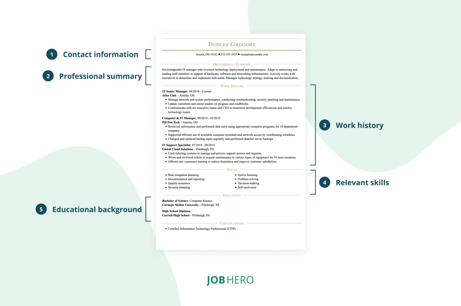
The typical resume summarizes a decade of experience per page, but most resumes feature the following sections. This uniform approach makes it easy for hiring managers to find your previous experience, skills and relevant education and training.
- Contact information: The contact section should be at the top of your resume and include your first and last name, city and state, email address and phone number. You can also add your LinkedIn or digital portfolio.
- Resume introduction: Up to three sentences in the form of a skills-focused summary statement or goals-oriented objective statement to persuade hiring managers to read past the average of six seconds they spend on each application.
- Relevant skills: List up to eight relevant skills that align with the needs of the jobs. Prioritize skills unmentioned in the resume introduction or work history sections.
- Experience: Start the work history section with your most recent job and provide brief, bulleted descriptions of your previous role and responsibilities. Aim to identify and share experiences that match or are related experiences to the new job.
- Education: Your education section can include formal education, such as degrees or diplomas, career-related training, certifications and relevant coursework.
2Choose the right resume layout.
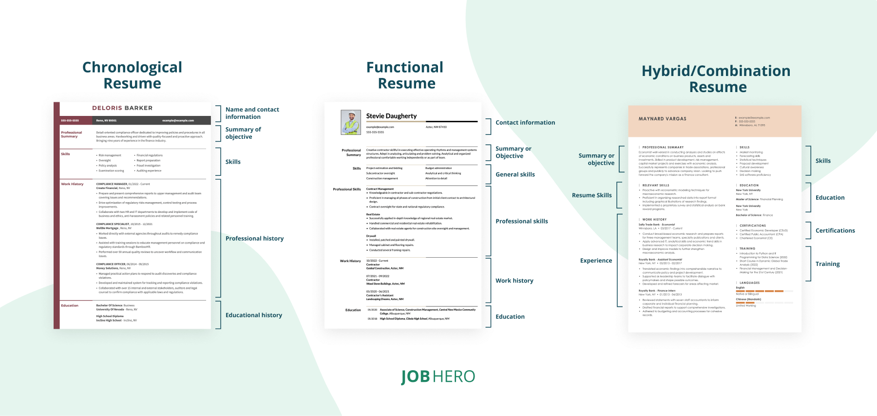
There are three main resume layouts based on your experience level: chronological, functional and hybrid/combination. Read on for a description of each to decide which is right for you:
- Chronological layout: This is the most traditional resume format and is best for seasoned candidates with over a decade of experience. Your work history sits high on the page and is the longest section, making it ideal for highlighting promotions and job-related accomplishments.
- Functional resume layout: The functional, or skills-based, format is a customizable layout highlighting your experience and achievements under related skills sections, not a dedicated work section. This format works best for new job seekers, freelancers, career changers and in-person applicants. Avoid this resume layout if you’re applying online without a direct referral. Applicant tracking systems struggle to parse and grade your information.
- Combination resume layout: This hybrid format combines the best chronological and functional formats by highlighting your relevant skills and work history. It’s best for candidates with three to nine years of experience because you can show your general skills growth under both sections.
3Set your margins.
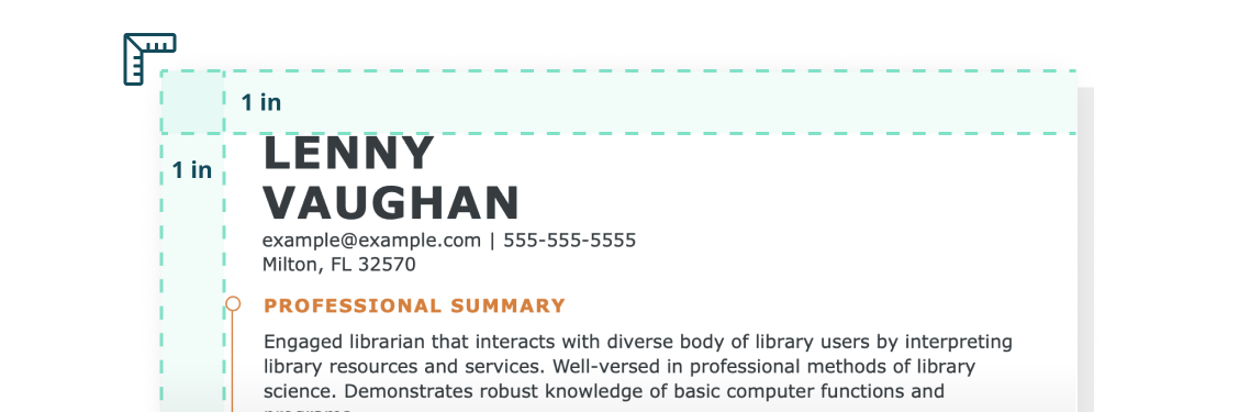
Set your margins to 1 inch. This helps create a visual frame around your accomplishments and avoids a dense, information-laden document that is hard to read. If your resume content spills over to a second page, you can reduce your margins to half an inch on all sides.
4Use white space and line breaks.
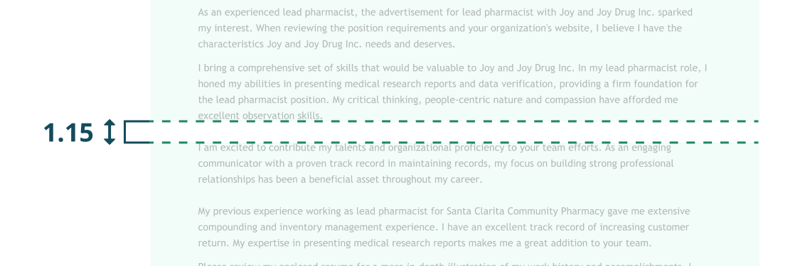
Use single or 1.15 line spacing within sections and double line spacing to mark the start of new sections. This creates white space that guides the eyes and reduces reading strain while making the most of a one-page resume layout.
5Pick the right fonts.
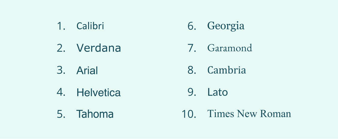
Although word processors have large font libraries, hiring managers prefer resume layouts with minimal, screen-friendly fonts like the these professional fonts.
6Use consistent font size.
Your section headings should be slightly bigger than the rest of your information, but your resume needs consistent font sizes. Set your headings to 14-20 points and the rest of your resume to 10-12, though this may change based on your chosen font. For example, Garamond and Arial are bigger than Calibri.
Key Takeaways
A well-designed resume layout showcases your qualifications and makes it easy for hiring managers to compare you to other candidates.
- A pre-designed resume template follows professional resume layout rules to reduce your resume writing worry and stress.
- The best resume layouts use key sections like contact information, summary, skills, experience and education to pass ATS and reach human decision-makers.
- Consistent margins, white space and clean fonts ensure a polished look.
Resume Layout FAQ
What is the best resume layout for ATS?
The best resume layout for applicant tracking systems is a timeline-based format because they include the five standard resume sections these programs are trained to scan and grade. If you write your resume with these ATS-friendly headings in mind, you can use either the chronological or combination format.
- Contact information
- Resume summary
- Work history/experience
- Skills
- Education
Which format do most employers prefer for resumes?
Most employers prefer the chronological resume because it is the oldest and most recognized format. However, you can use the combination resume if you have less than 10 years of experience because this format includes the same sections in a slightly different resume layout.
How far back should a resume go?
We recommend limiting your resume to the last 10 years of experience, though there are some exceptions to the rule.
- Add additional experience if you’re applying to a senior or executive position and must show leadership growth.
- Add older experience if you’re re-entering the workforce
- Add additional experience if it relates to the open job requirements.
Learn About Our Writing Standards
Editorial Standards
JobHero has published in-depth career guides, resume and cover letter articles since 2014. We aim to share job-seeking tools and empower job seekers throughout their careers! Visit our Editorial Process to see how our authors research, write and revise our articles.
Gabriela Barcenas
CPRW, Career WriterGabriela is a Certified Professional Resume Writer (CPRW) and member of the Professional Association of Resume Writers & Career Coaches and has worked in the career industry for more than seven years providing comprehensive guidance on resume writing and job search strategies for individuals across diverse career paths. She holds a bachelor's degree in English and creative writing and is passionate about helping job seekers present their professional story effectively through well-crafted resumes and cover letters that demonstrate their value, skills, and experience to potential employers. Some of her work has been featured on JobHero's resume examples career center.
